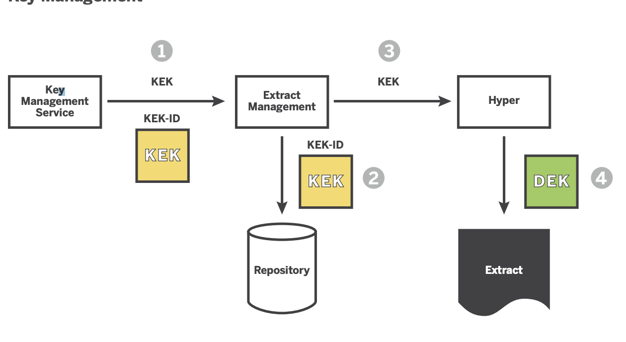
Data security is by far one of the topics that we have been asked to help with the most. One of the solutions we usually adopt is to encrypt...
#MakeOverMonday is a concept in the data world. What is Make Over Monday? The idea behind #MakeOverMonday is to give an existing visualisation a Make Over. This visualisation...

This week the Alteryx Europe event of the year is in full swing. Location has been in London for years in a row, but next year this fantastic event...
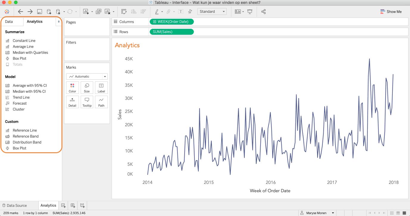
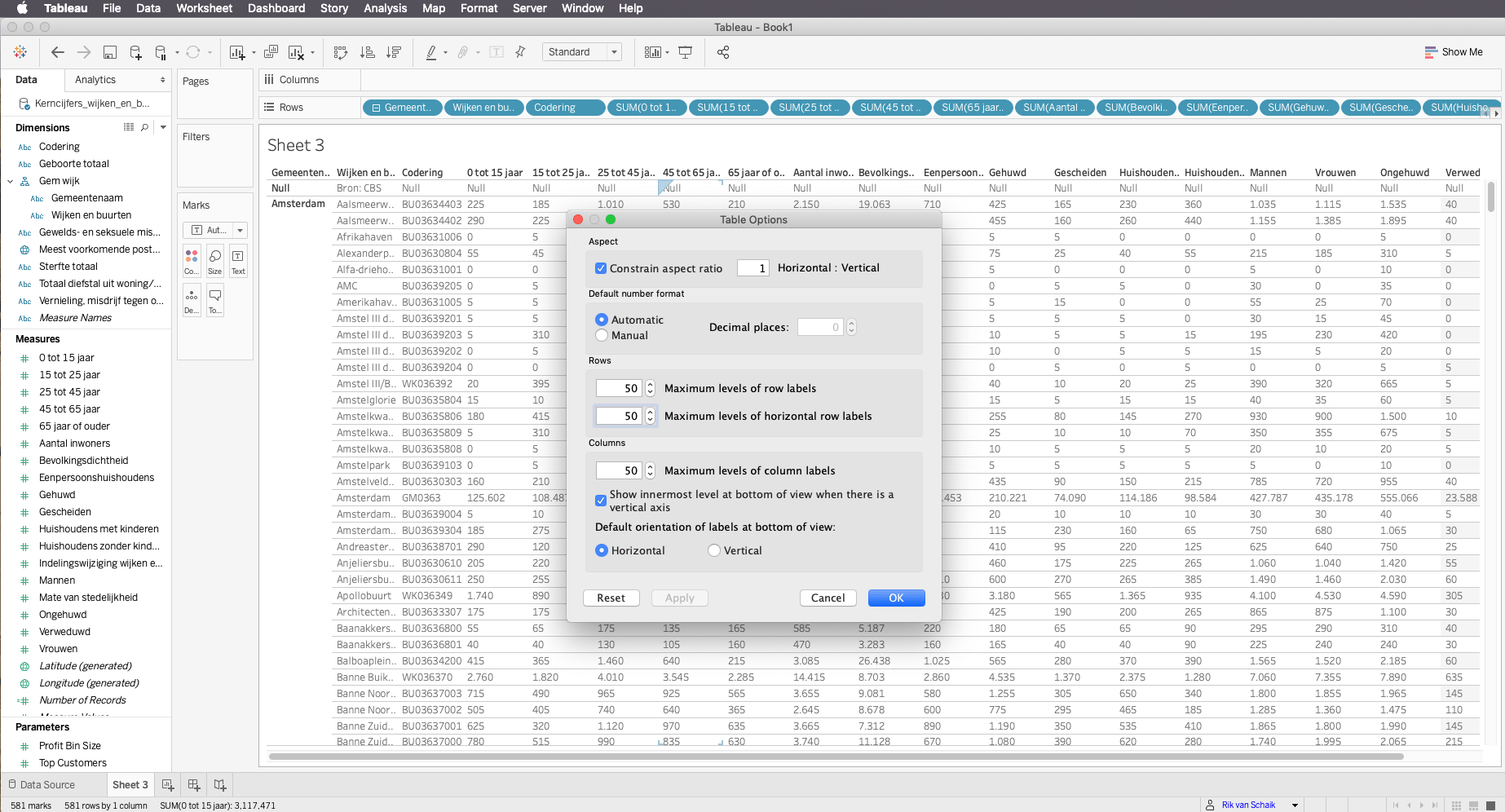
Visualisations can be built on a sheet. A sheet is part of a workbook, the file in which you are working. Menu and tool bar At the top of the...
Why do we visualize our data? So often end-users will ask for a table, not unlike Excel (which they may be more familiar with), with summarised data.French statistician Francis...
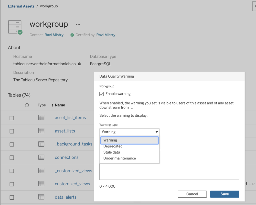
Tableau 2019.3 has been out for a few weeks now, so let's look at some of the new features, and run through some use cases. In this blog you can...
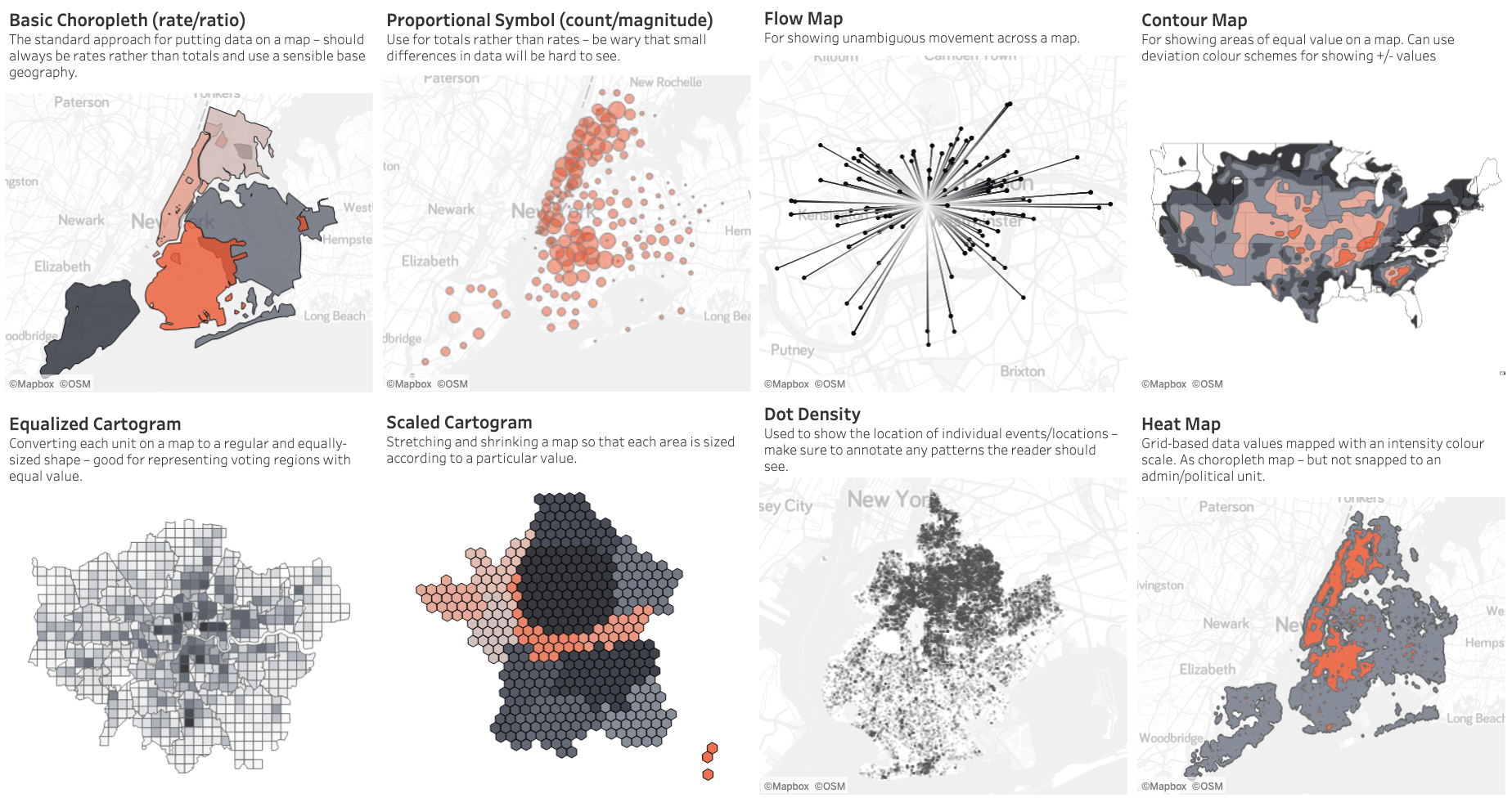
There are so many ways to visualize data - how do we know which one to pick? Zen Master and head of The Dataschool, Andy Kriebel, is always there....
The easiest way to highlight certain parts of your chart is to use the Highlighter function. When you right-click on a dimension and...
First question with me is why would you want to use very large tables? Yet we encounter it fairly regularly in various departments, but remarkably more often in financial...