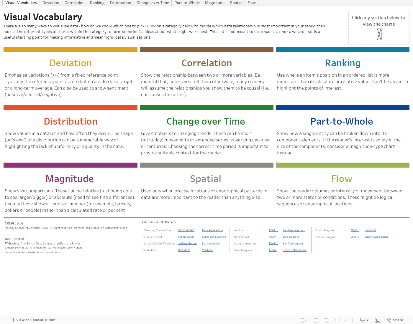
There are so many ways to visualise data – how do we know which one to pick? Zen Master and head of The Dataschool, Andy Kriebel, is always there to help you. He created a Tableau dashboard where you can select a category to decide which data relationship is most important in your story, then look at the different types of charts within the category to form some initial ideas about what might work best. The list is not meant to be exhaustive, nor a wizard, but is a useful starting point for making informative and meaningful data visualisations. Check out the viz below or click here for better view.