Tableau Public is great for sharing your work. Many call it the YouTube of visualisations. But I ran into a problem: I couldn't find any 'live' data...

With a funnel, you can clearly show how many prospects or visitors drop out at each step of the process. A funnel is often used...

What is a slope chart? Slope charts (or graphs) are essentially a streamlined version of a line chart. Meaning that a slope chart shows the developments between two points....

This blog tells you how to Prepare and Pass Tableau Desktop Specialist Certification as a New User. At the least it provides a great list of useful links.
In my previous blog post I made an attempt to make the Logshark application more user-friendly for the MacOS user. After testing with users, it became clear that the updated...

A particular period of history, especially one considered remarkable or noteworthy… The beginning of a new and important period in the history of anything… A milestone. These are a...
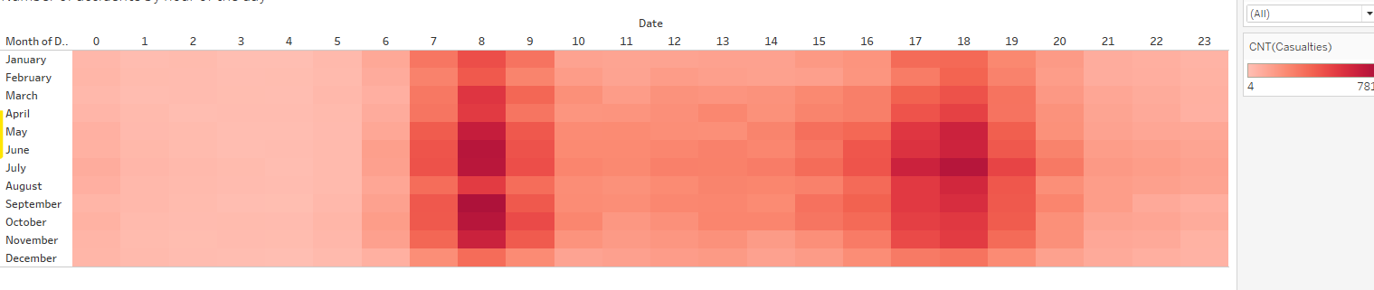
Combining times: a heatmap with two time axes Every organisation talks about growth, developments, trends. So you can compare the turnover of different years to find out what...

How to easily create a time animation in Tableau? You show beautifully the sales by quarter, by region, also you have a ranking in it, but still it doesn't look...

In the first dashboard I published on Tableau Public, I use a created set using a dynamic TOP-N filter. With this blog, I explain the...