
Once you know the basics of building views in Tableau, creating a dashboard is only a couple of drag and drops away. When it comes to making your dashboard look visually appealing, some elements need to be considered. It is easy to fall into the mistakes of poor dashboard design. Rather than telling a clear story with your data, the user can take a long time trying to interpret what the dashboard wants to say. As well as understanding where to focus on. In order to show you what I mean, take a look at the two following dashboards:
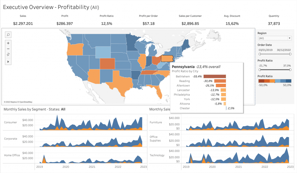
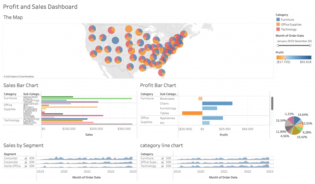
In the first sample dashboard, the elements that make the design consistent and easily interpretable are there. From spacing, explanatory titles, consistent colour usage to dashboard actions, grouping of charts and more, the dashboard is well designed. While compared to the first dashboard, the second one lacks a lot of consistency and communication. In this blog, I will go through some tips in order to reduce unnecessary clutter and reach a more efficient dashboard design using Tableau. Without further ado, let’s start with the first point:
#1 – Consistent Coloring
As seen in the examples above, consistent colouring is key to communicate qualitative and quantitative differences. Misuse of colour can lead to confusion. For example if you use the colour orange to categorise a dimension member as well as to show lower profit levels on another chart. It is not best practice. This element is important in what the dashboard is trying to communicate.
While using colour to represent categories, also be careful. After a number of categories, the colours can get visually cluttering in your views. I would prefer to see categorical colouring with around 3 to 5 dimension members. Or else your views can look like this:
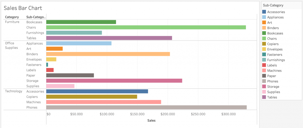
This can get especially cluttering when you also use colour in other views to represent quantitative differences. Keep your colours consistent throughout your dashboards.
#2 – Watch the Amount of Marks in a View
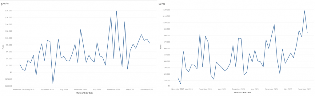
From the title, this particular tip can seem open-ended. What I mean by this is to watch out that your view is not too cluttered with information. In some cases, it is best to create a number of views, rather than creating a combined axis chart and squeezing all dimension members together. Even though this might be a subjective topic, to minimise processing time in our brains, it is important to keep views as streamlined as it can be. Take the following example:
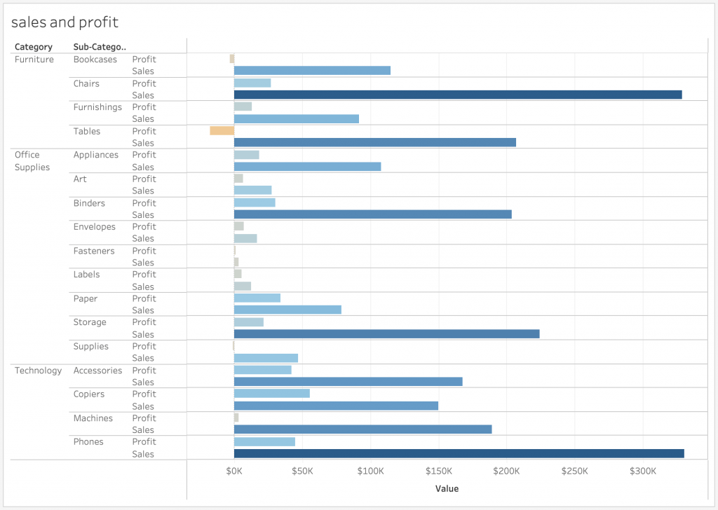
In this case, there is a bit of a trade off. With a combined chart, you might run into cluttering issues since the profit and sales measures are repeated for each sub-category. However, it is easier this way to compare the measures with each other.
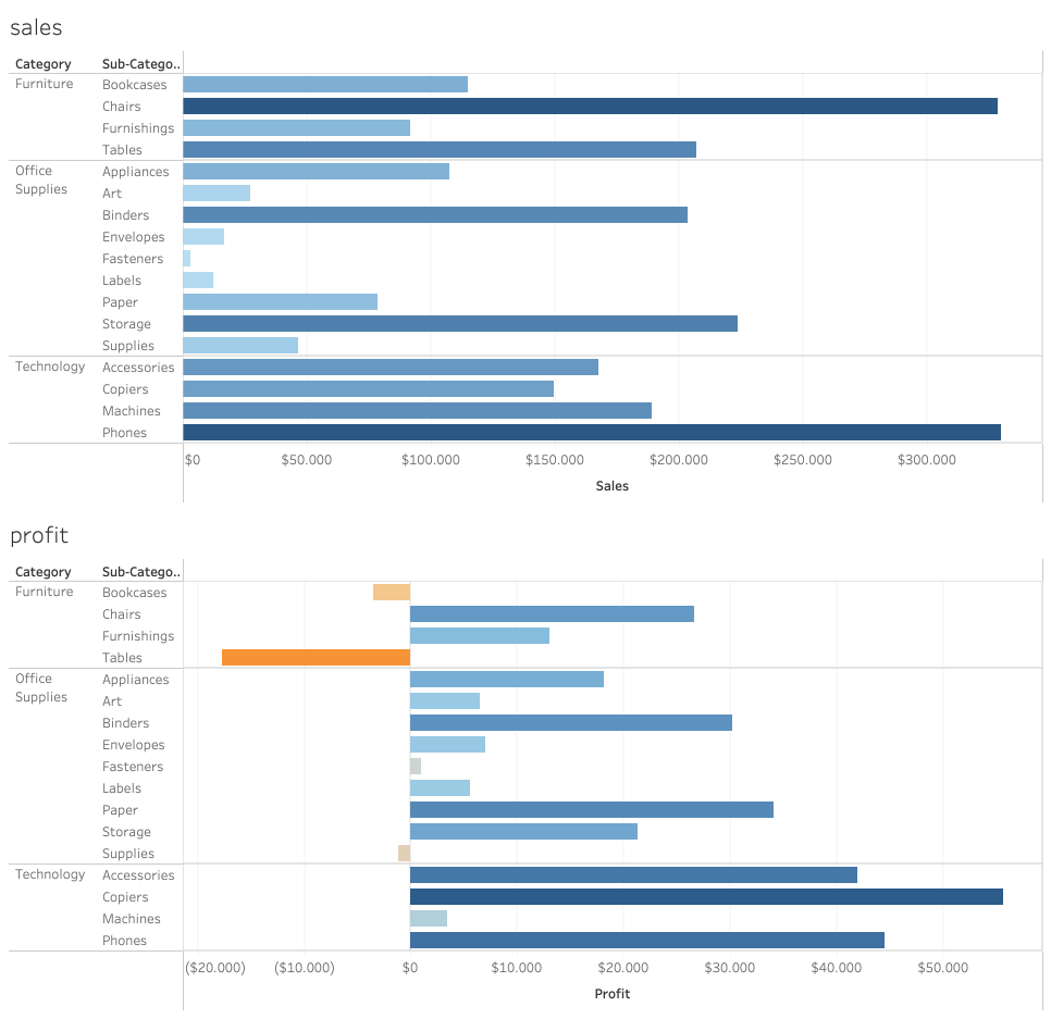
Above we have the measures now in different views. When using them in a dashboard, it is possible that they take more space but much less cluttered within. However the trade off is that it is harder to compare the measures within each sub category.
But combining charts does not mean that you will always have clutter. For example while using a double axis chart, you can combine two views in one. As an example I can create a dual axis chart combining sales and profit information with date to save space and have it in a concise way than to create two different line charts with profit and sales:
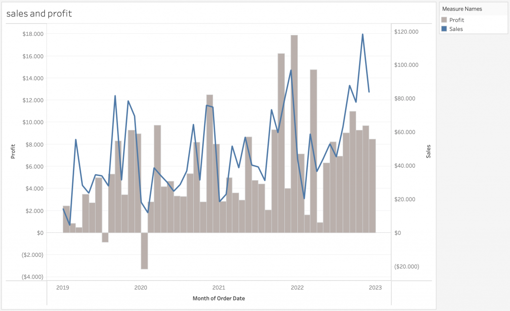
The design on the dual axis chart can be changed to your liking. See this link to create a dual axis chart and a shared axis chart in Tableau.
#3 – Formatting your Views
The third point I would like to make is that there are quite extensive formatting options in Tableau for you to change what is included in your view and what is not. While building dashboards, you sometimes will repeat information like axis labels. In some cases, they are better left out just so that the dashboard does not get cluttered with unnecessary titles and axes. Watch the short demonstration on how you can get rid of certain elements in an example bar chart:
This small and easy trick can save u quite a lot of space in your dashboards. However, make sure you don’t hide too much information where the user does not understand what they are looking at.
#4 – Using Tooltips
One great feature of Tableau is its tooltips. Tooltips are a great way to “hide” information within views and is accessed when hovering over specific marks. Automatically, tooltips are created with each view you create for more information. However, you are also able to put views into tooltips along-side text.
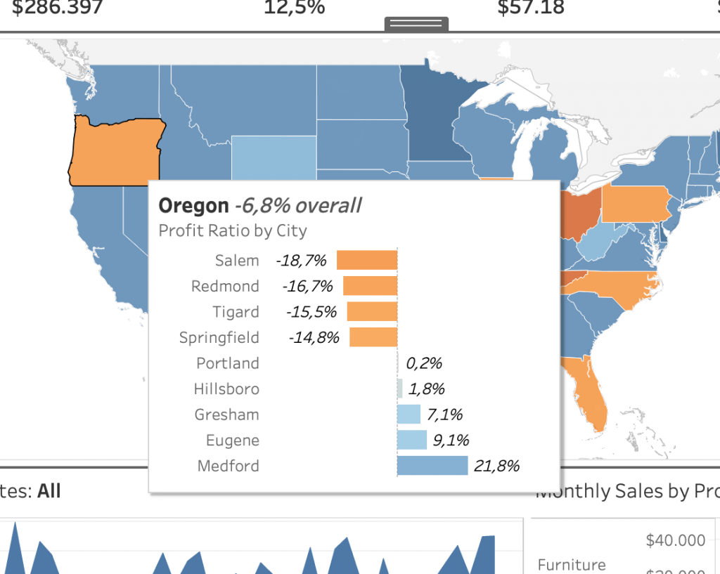
This is a great way to clean up space in your dashboards. Especially when there is more information that needs to be included, but not enough space in the dashboard to put it. Check out this link to get more information about inserting views in tooltips.
#5 – Sheet and Measure Swapping
Sheet and measure swapping in Tableau is an action done with parameters to switch out a measure in a view or the whole view for another with a quick selection. This is another trick to use when dealing with spacing and clutter issues. Below are two videos showcasing sheet and measure swapping in Tableau:
Measure swapping is a technique that allows the user to select a particular measure that is to be swapped in an axis for a chart. And sheet swapping is a very similar technique but allows a whole sheet to be replaced with other ones. Both use parameters to complete the action and are great ways to save space and also adding interactivity to your dashboards. To know more about measure swapping and how to do it yourself, check out this link here. Likewise to know more about sheet swapping, visit this link.
Conclusion
In addition to these five tips for space management, there are many more tips out there for efficient design when it comes to dashboards in general. These were my five tips that were Tableau centred. Some of these tips can be subjective. Different people can have different opinions about what is a good use of space in a dashboard. However, I personally believe that these tips do help me in the effectiveness of my dashboards.
Check out our blogs page to view more blogs on Tableau, Alteryx and Snowflake here.
Work together with one of our consultants and maximise the effects of your data.
Contact us, and we’ll help you right away.