
The dataset we will examine, taken from A century of weather in The Netherlands on Kaggle, covers 120 years of observations made in De Bilt, the KNMI base office, located in the center of the Netherlands. It covers data on various parameters such as temperature, wind, relative humidity etc. In this post, we will mainly explore temperatures, or more exactly, temperature anomalies, in order to visualise and analyse trends.
In order to explore the vast amount of daily observations, we will use Tableau to show the overall trend of temperature change across years and use it to better understand the fluctuations of temperature. Doing that, we will also get aquatinted with the term Running or Moving Average and understand its use.
What is a Moving Average?
Moving average is a technique that help us smooth time series data, and to reveal underlying trends. Usually, raw time series data is full with observations and noise that obscure us from identifying the underlying trend. The Moving Average, thus, reduces the ‘noise’ and allows us to emphasise the signal (Temperature) that can contain trends and cycles.
Moving averages are a series of averages calculated using sequential segments of data points over a series of values. They have a length or an interval, which defines the number of data points to include in each average.
In order for us to try and remove seasonal patterns in our data, we need to set the interval of our moving average to equal the pattern’s interval. Longer intervals will produce smoother signals.
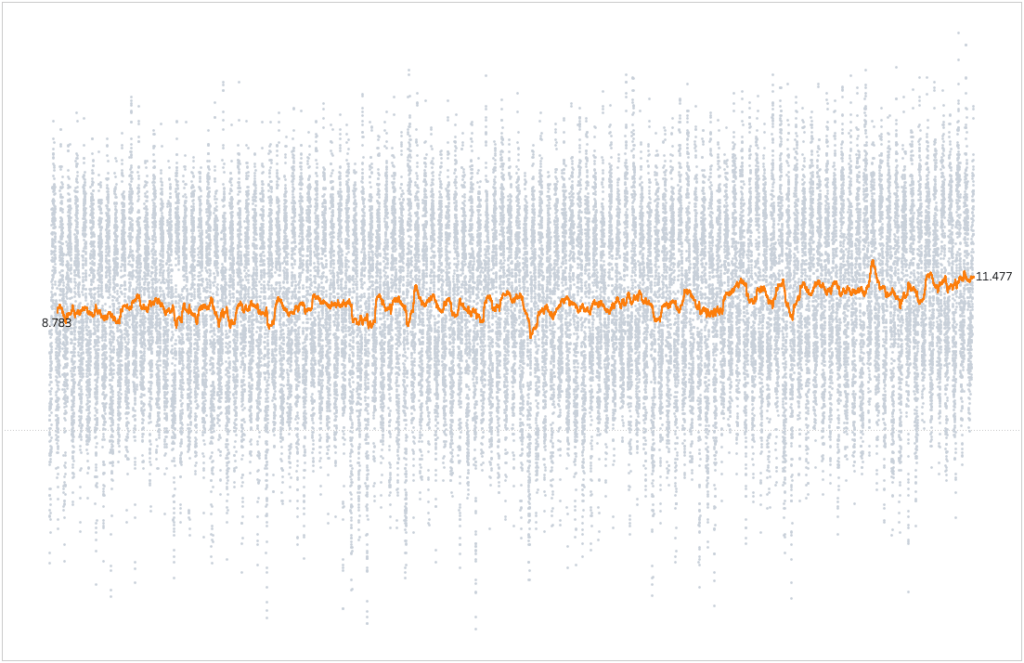
It is very important to note that ‘seasonal’ patterns don’t necessarily mean a meteorological season like in our use case. Instead, it refers to a repeating pattern that has a fixed length within the data. In our case we would like to set the interval to be 365 days (Since we are on a Daily View). Notice how the seasonal pattern is gone and the underlying trend is visible. Each moving average point is the daily average of the past 365 days.
Calculating Moving Average
There are 2 ways to incorporate a Moving Average using Tableau Table Calculations:
- With our time set to daily we will use Tableau Table Calculations Module and simply create a calculated field (e.g. ‘1Yr Moving Average’).
For a Running Average of Temperature for the previous 365 days we can use:WINDOW_AVG(AVG([Temperature]), -365, 0) - Using the build-in Table Calculations Menu:
- Right Click on the Measure capsule (Temperature)
- Add Table Calculation
- Calculation Type: Moving Calculation
Summarise values using: Average
Previous Values: 365 - Check the box for Null if there are not enough values
Temperature Anomalies
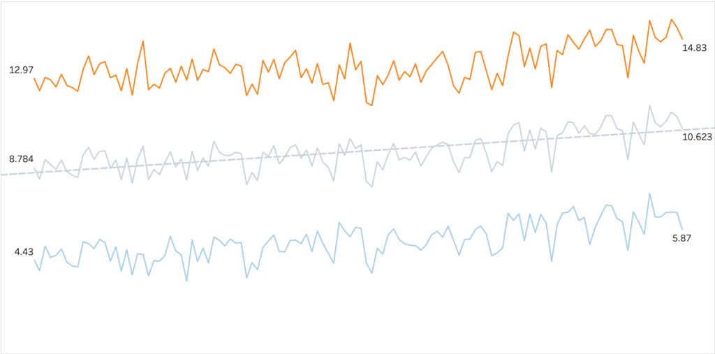
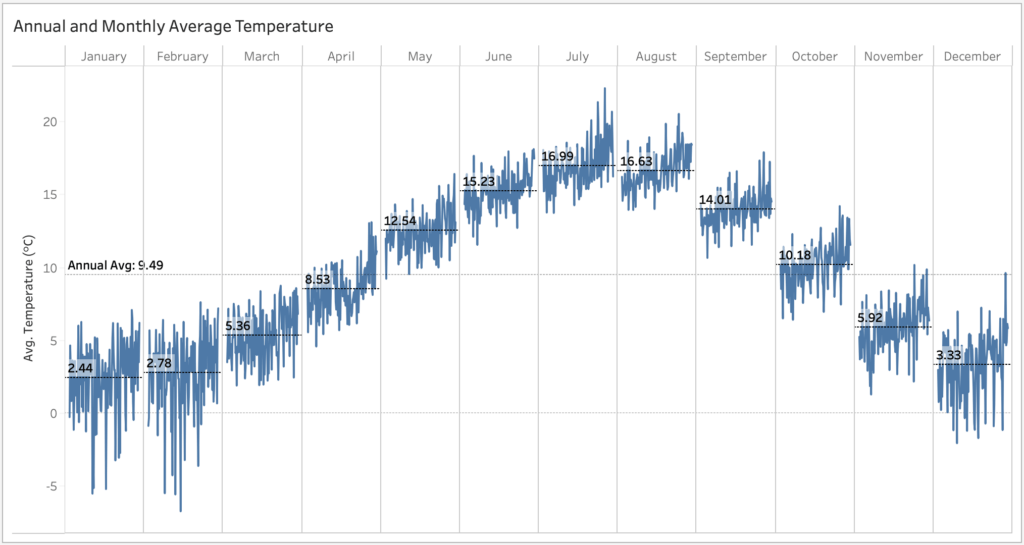
In the image below we can see the Annual Average Temperatures and Min/Max Temperatures for 1901-2020. Average temperature has clearly increased in almost 2°C, since the beginning of the century.
When studying climate change, Temperature Anomalies are sometimes more important than absolute temperature. A temperature anomaly is the difference from an average, or baseline, temperature. The baseline temperature is typically computed by averaging at least 30 or more years of temperature data.
Calculating Anomaly
Starting with Annual Anomalies, we would like to view each year’s difference from our reference baseline. For start, we will calculate the baseline to be the average of temperatures between 1901-2020. We will set our Columns to Continues Year and add Anomaly (Annual), A calculated field for the difference from our baseline.
AVG([Temperature]) - WINDOW_AVG(AVG([Temperature]))

And add a copy of our newly created calculated field to Color.
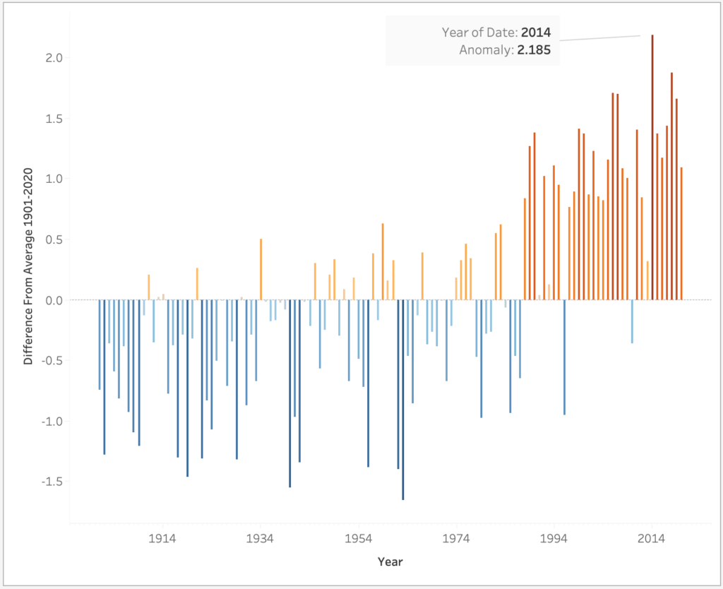
Our trend is slightly more visible now, and we can clearly spot 2014 as the hottest year in the Netherlands. Unfortunately, our dataset ends in July 2020, so we miss to see the year 2020 taking the billboard as well and joining 2014 as the two hottest years ever (KNMI).
With a side note, another possible way of calculating a Difference from average can be done with an LOD:
AVG([Temperature]) - {AVG([Temperature])} with {AVG([Temperature])} as a fixed average for the whole dataset.
Monthly Views
So far we have mainly looked at the overall trend in temperature change across years. Let’s check the monthly anomaly and trends along time.
We’ll shift our time dimension to a Continues Month and calculate the temperature anomalies in conjunction with a 10 Yrs Running Average. Our baseline is still the average of temperatures between 1901-2020.
WINDOW_AVG(AVG([Temperature]) - WINDOW_AVG(AVG([Temperature])), -120, 0)
Since we are on a Monthly view, each mark is a month, thus our first argument within the moving average function is -120 (10 years).
A positive anomaly indicates the observed temperature is warmer than the baseline, while a negative anomaly indicates the observed temperature is cooler than the baseline.
Over the past 120 years, the temperature has increased in all months
KNMI
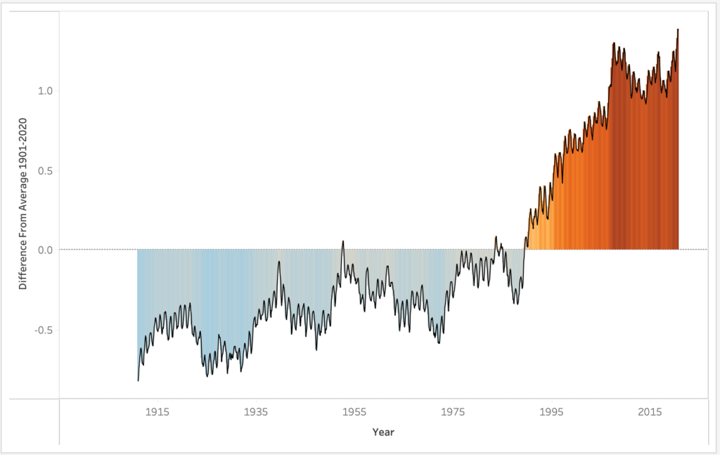
Temperature Anomalies enable us to better understand the overall trend of temperature change since the beginning of the last century. We can clearly see the change of trend around the ’90s, where we observe an ongoing increase of positive anomaly.
Sometimes, an average of the last 30 years is used as a baseline average. It can be somewhat tricky to pull that out and I use an LOD fixed calculation for that, with 360 as the number of months (30 Years).
({Fixed :AVG(IF DATEDIFF('month',[Date],{MAX([Date])}) <= 360
             THEN [Temperature]
             END)})
For example, KNMI’s baseline average is calculated as 1981-2010 average, and Starting in 2021, they will use the 1991-2020 average as their new baseline.
Feel free to further experiment with different baselines. Different baselines will naturally modify our anomalies and the magnitude of trend.
Monthly Trends
Trying to explore the trends in each month along time, we can see in the visualisation below the average temperatures for each month. These Monthly averages will be used later on to visualise the trend within each month.
Examining a 10 Yrs Running Average of Temperature Anomalies compares the difference in magnitude of increase per month for the span of data along 1901-2020. We will set our Columns as shown and add to the Rows our mentioned calculations.

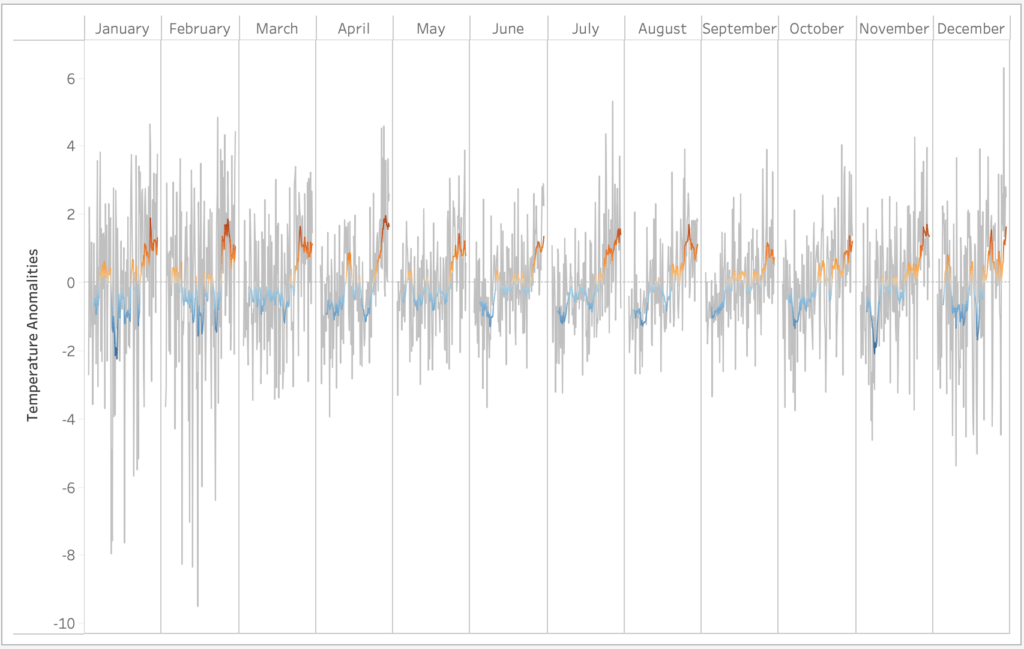
The plot shows a dual axis for monthly anomalies (grey) with a 10 Yr Moving average on top. One thing to note here is that the baseline average is calculated per month for the entire dataset as annotated in the first cycle plot. To make Tableau adjust the window average in such a way, the table calculation needs to be computed using pane across (months).
As mentioned earlier, the moving average reduces the ‘noise’ and allows us to emphasise the signal while smoothing outliers. Taking a closer look on the 10 Yr Moving average Anomalies we can clearly spot April’s increasing anomaly.
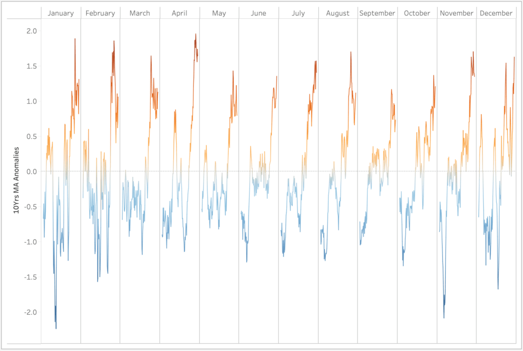
Although not all months behave the same, it is quite obvious that all months trend to an increasing anomaly.
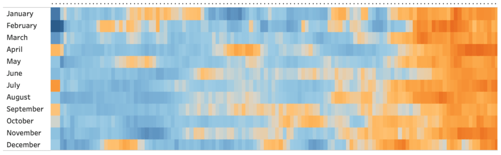
Finally, we can take the monthly trend overview and further look at the monthly anomalies along 1901-2020 as a heat map. It certainly gives us another perspective to how temperature anomaly trends over time.
To produce this kind of heat map we’ll adjust our Rows and Columns.

Then create a calculated field for a 10 Yrs Moving Average Anomaly:
WINDOW_AVG(AVG([Temperature]) - WINDOW_AVG(AVG([Temperature])), -10, 0)
Drag it to Color (Pallet: Reversed Orange Blue Divergence) and change the chart type to shape (rectangle).
That’s it! All we need to do is set the size and inflate the rectangles so they touch each other.
Summary
In this post we have used Tableau to visualise and analyse trends of Temperature in the Netherlands. We have looked at annual and monthly trends while using core concepts as Moving Average and Temperature Anomalies to help us with our investigation. You can find a Workbook containing all mentioned examples on Tableau Public.
In future posts I will explore other weather aspects within the dataset. I hope this post will motivate you to explore weather data a bit more.