In this article, we will learn how to create a Doughnut Chart (aka Donut Chart) and get to know better the ways we can manipulate a Pie chart to produce a Donut Chart.
A recent post added by a colleague of mine, explains why should we re-think when trying to apply pie charts to our data. Pie charts, as the post mentions, don’t have the best reputation, so it’s a good opportunity to look for another candidate along the food chain. A Donut is yet another kind of sweet delight that might take away the heavy feeling we tend to get when messing with pies…
A doughnut chart is essentially a Pie Chart with the centre area cut out. It is possible that the doughnut has the power to de-emphasize the use of the obvious angle in a pie. Instead, viewers can focus more on the length of the arcs rather than comparing slices. Another possible advantage is to make use of the free space in the centre to add other information or to report statistics.
Although it is quite straightforward to build a Pie Chart in Tableau, a Donut Chart is not an out of the box feature.
For this demonstration I will simply use the sample superstore dataset that comes along with Tableau desktop.
Step 1: Create a Table
First, Let’s create a table and see what we are planning to do:
- Let’s drag Category and Sub-Category to the Rows.
- Drag Sales and drop it onto Label.
- We will also drag Order Date to Filters to include only 2021.
Let’s have a look at the table we have just created as the basis of our Pie Chart:
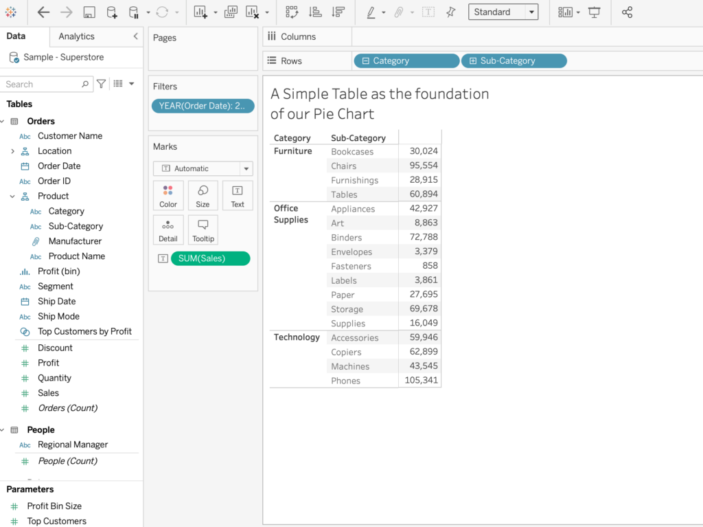
Our goal is to visualise what is the composition of the different Categories and to find out what is the relative sales amount of each Sub-Category. So let’s go ahead and create a Pie on the table…
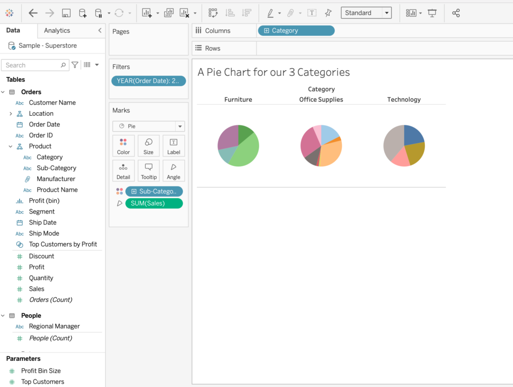
Step 2: Create a Pie Chart
- Under Marks, select the Pie mark type.
- Drag Sub-Category from Rows to Color.
- From Label, Drag Sales to Angle.
- Finally, Drag Category to Columns.
Step 3: Add Placeholders and switch to the dual-axis chart
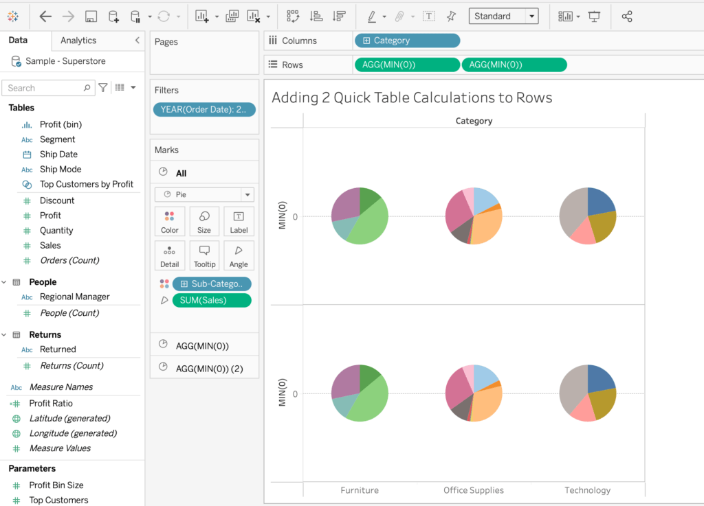
We will now add 2 Placeholders on the Marks Card Shelf and duplicate our Pies to populate them. We will achieve that by adding an ad-hoc calculation to Rows, duplicate the measure and switch to dual axis.
Creating the placeholders is essential for creating a Donut Chart, But it also has many other uses.
Placing each newly created measure on the Rows or Columns creates its own Marks Shelf, where we can edit each Marks Card independently. This nifty little trick allows us to have more options with modifying our visualisation.
- Double click on Rows to add a Quick Table Calculation.
- In the table calculation fill in MIN(0).
- While holding the Command Key (Control key in Windows),
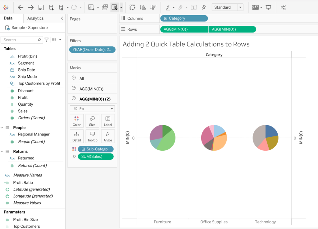
Drag and duplicate the ad hoc calculation as another measure to Rows. - On Rows, right-click the second instance of AGG(MIN(0)), and then select Dual Axis.
It will basically merge the Pies onto the same axis.
If you find Placeholders a bit confusing, take the time to discover some more about Unlocking the mysteries of placeholders with other interesting use cases.
Step 4: Sugar Topping
Now that we have created our two placeholders, we can edit them as we like. It is time to turn our pies into donuts.
- On the Marks card, click AGG(MIN(0))(2)
- Remove both Sub Category and Sales
- Click Color and choose white
- Switch to the other card AGG(MIN(0))
- Click Size and make the pie bigger
- Hide the headers of both axes
- Format the canvas and change the Grid and Zero Lines to None
- Make sure to edit and correct Tooltip and Text Labels
- Switch back to second placeholder (AGG(MIN(0))(2))
- Add Sales to Label, set it to the centre of white circle and Format as you see fit
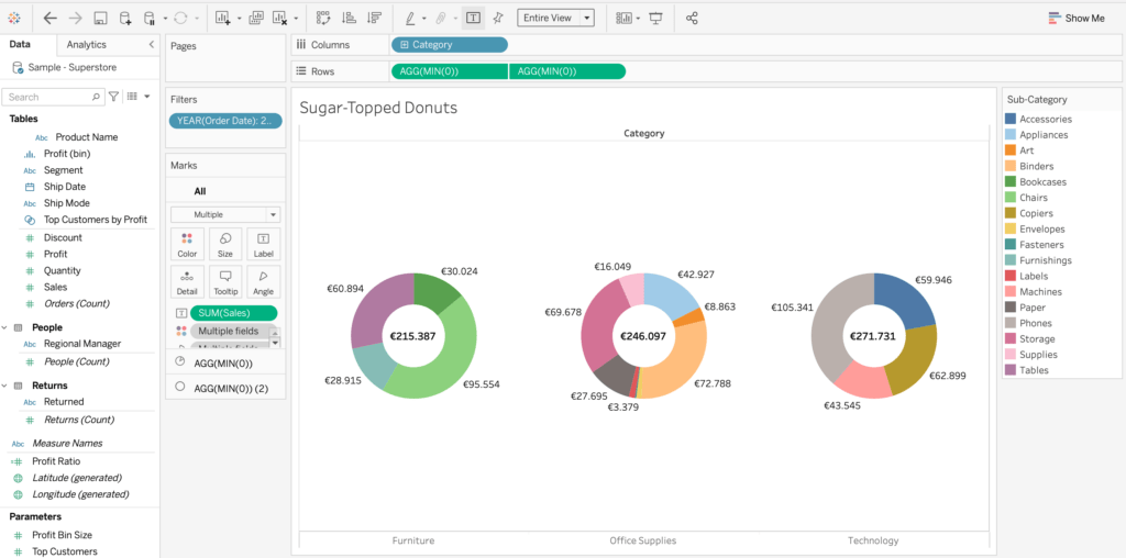
That’s it! Our Donut Chart is ready. you can find this example vis in Pies and Donuts.
Pies and Doughnuts – Food for Thought!
The question of when to use a Pie Chart or rather convert it to a Donut Chart is always valid. Another question might be why are we so fond of Pies and Donuts at the first place? if we deep dive into history we might find out that this popular kind of chart is quite ancient and used by numerous civilizations. Read through An historical and evolutionary perspective to check out why we tend to adore these kind of charts.
To find out what are we really onto when looking at a these charts check out the results of three studies, who try to bluntly show how wrong we are really when it comes to Pie Charts, and the fun part is that donut charts are no worse than those old pies.

