
Being able to distribute sheets evenly in your dashboard is a handy skill. For instance, it can be useful whenever you want to show a set of KPIs at the top of your dashboard. Similarly, you can use it to give your charts the same height without manually adjusting their size again and again.
In this blog, I will present two tricks to distribute sheets evenly. The first involves containers, and the second makes use of Measure Names and Measure Values. At the end of each explanation, I have added an example viz. You can click here to navigate to my Tableau Public profile and download the workbooks.
Distribute sheets evenly with a container
A simple trick to distribute your content evenly is to add a container to your dashboard, and drag your charts within it. This trick works both for displaying KPIs or any other type of charts next to each other.
Depending on how you want to display your charts, you can choose a horizontal or vertical container, check out Aline’s blog here to learn more.
Here are three simple steps you can follow to achieve this result:
- Drag a container into the view
- Drag the sheets you wish to spread evenly
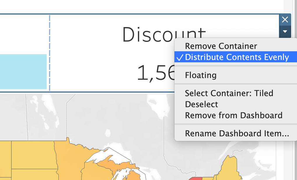
- Click on the little down-facing arrow on the top right of the container, and select “Distribute contents evenly” from the drop-down menu, just like in the picture below:
That is how easy it is to distribute sheets evenly in Tableau
EXTRA TIP: find the container easily
If you are having a hard time clicking on the container, click on a chart within it, and click on “Select Container: Horizontal/Vertical”:
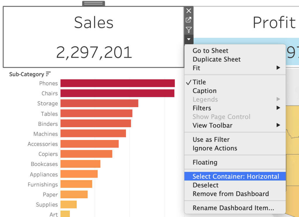
Remember: containers have a blue border, whereas charts have a dark grey one.
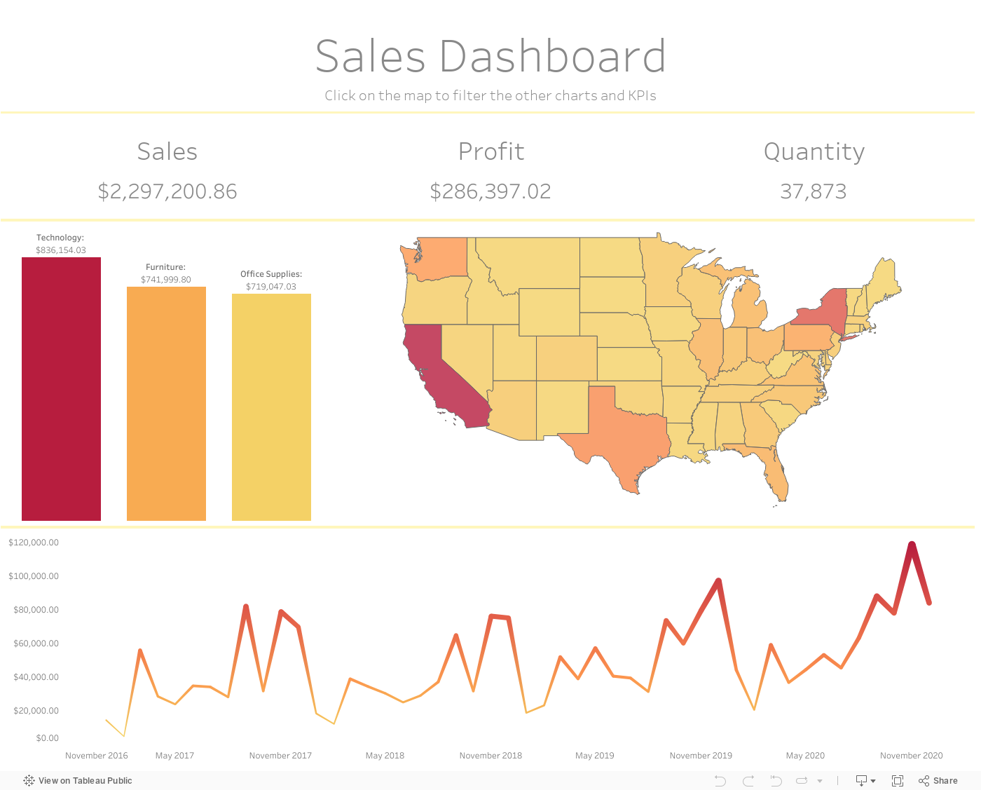
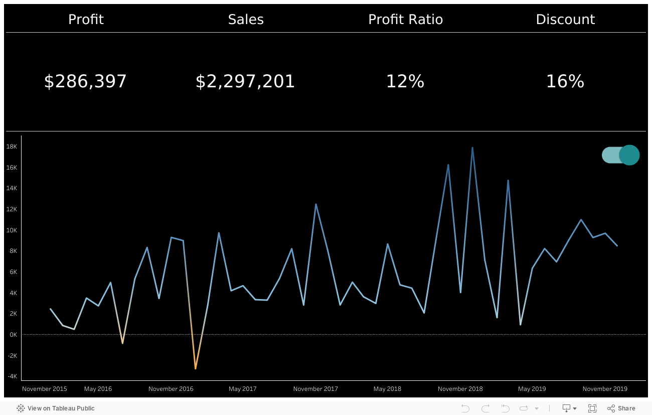
Check out an example of how to use this feature in a dashboard:
Distribute sheets evenly with Measure Names and Measure Values
If your goal is to display a KPIs bar at the top of your dashboard, such as this one:
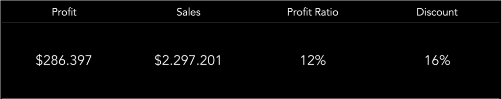
you can leverage Measure Names and Measure Values. In fact, if you create one sheet with all your KPIs together, Tableau will take care of distributing them evenly by default.
How to:
- Drag Measure Names to Columns, Measure Values to Text
- All your measures will be added to the view. Drag the ones you don’t want to display out of the view.
- Center the text and adjust the size and color to your liking.
Here is what it looks like in a dashboard:
Do you want to learn more about Tableau or Alteryx? Do you want to use these tools to their full potential? Check out our trainings and consultancy services!