
Last time we discussed showing dynamic date labels, and today we’ll have a closer look at providing extra information for our end-users when dealing with large numbers.
When providing summary insights for end-users while we’re dealing with large numbers, we might choose to show numbers in thousands or millions to:
- increase the readability
- it gives a wider picture
- provide a true summary
So, to explain the process I’ve created as an example a summary overview of Sales and Profit Ratio where we compare these numbers over time we can see a nice high level overview.
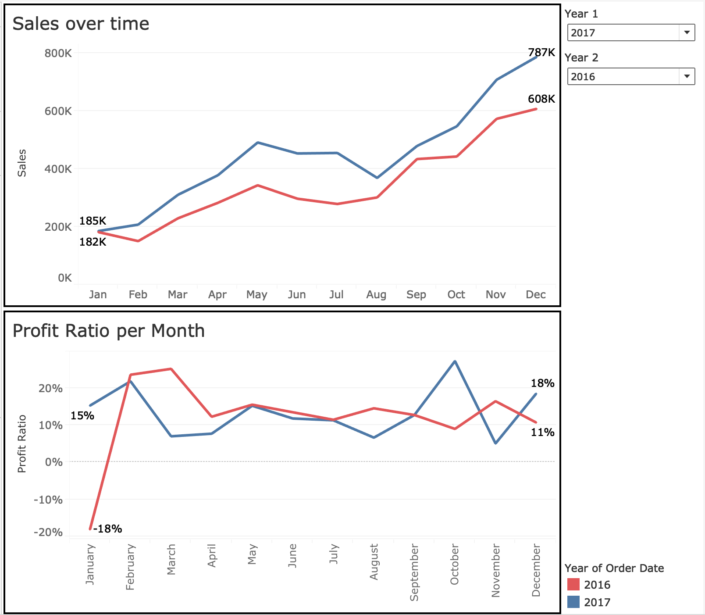
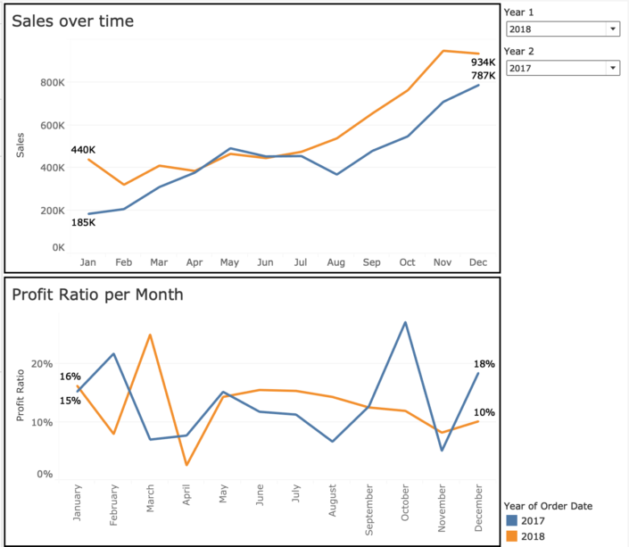
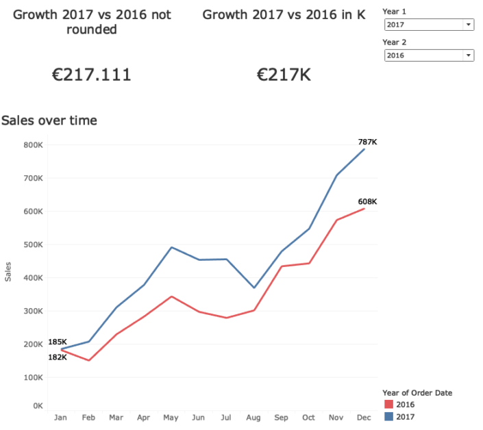
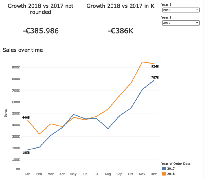
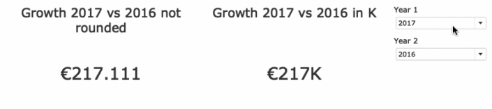
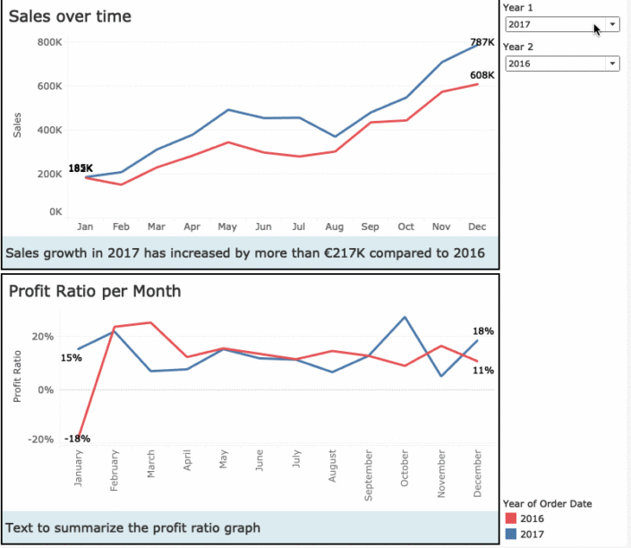
It is not uncommon for an end-user to want to compare one year’s results with another; and of course we can help them by making that calculation for them, but as the results are in thousands of unit we lose some important information, especially if these are KPI numbers. Comparing 2017 results with 2016, and the growth is the 217K, if 217 is also the goal we still do not know if they surpassed this goal, or are actually falling behind (all be it by a little bit). The same with the growth comparison of 2018 with 2017, which is -386K. But this could be well over 386K.
An option would be to show the exact number in a tooltip, which can be a nice clean solution.
Another would be to summarise the results in text, and write wether or not the number is surpassing the 217K or is actually a little under.
The second option is especially useful if you’d like to cater those users who like dashboards, but do want to interact too much (or like to receive a summary in their email).
To create this we need several things:
- A calculated field that looks wether an outcome represents a positive change or a negative change
- A calculated field that looks wether an outcome in K is rounded up or down
- A good idea to create a logical sentence for your users
- A sheet wherein we display a summary text
We’ll start by creating the 2 calculated fields.
For convenience we’ll say that growth that is not negative, but positive – as the object of this blog is not on how to precisely determine positive growth, that will do for now. In reality we would have to take into account that no difference between 2 numbers is neither growth nor decline. And for even more detail, as we are showing K’s we should take into account difference that will show as OK. But that is for another time!
The other calculated field is what we will focus on.
We need to compare the K number shown by Tableau with the actual number divided by 1000. As in essence the K number is a rounded number, we should compare this with the integer of the same number divided by 1000.
Creating the integer will return the whole number before the decimal point. Creating an absolute of this number is useful as we might work with negative numbers.
Here you can find the calculated field to use: ABS(INT([Variable]/1000))
Creating the Rounded will return the number that Tableau will show when displaying K numbers. Again we’ll use the absolute version of this number to take into account negative numbers: ABS(ROUND([Variable]/1000))
Now we can compare those two numbers: if the integer is smaller than the rounded number this means the K number will show as rounded up. Therefore the actual number of the KPI is almost the number shown by Tableau.
Now we are nearly done, for the final step we’ll need to create a logical sentence we would like to display. For this we recommend sitting with your end-users (or at least a few key stakeholders) and create a logical sentence. As in this case we are our own stakeholder we created something we believe appropriate 🙂
For our final step we need to create a sheet, but why do we need it?
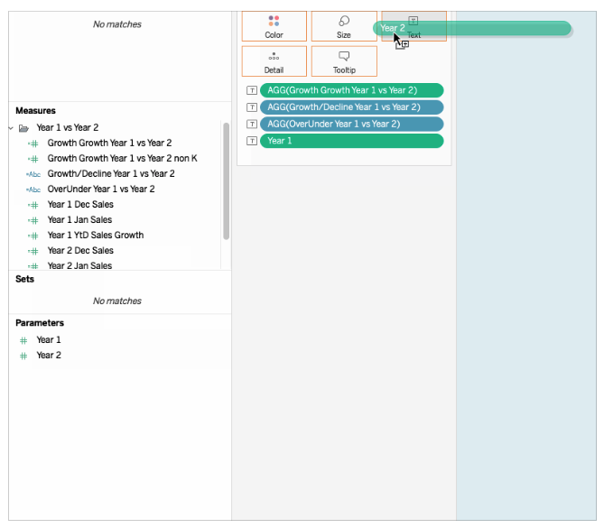
To create a dynamic text we’ll use calculated fields, and we cannot use those in “Text” object within the dashboard. So we’ll create our own “text object”, a text field within a sheet which we’ll use as a summary text object.
We’ll drag all the fields we would like to use in our summary on “Text”; now if we click on “Text” we can look at the jumbled text Tableau has created.
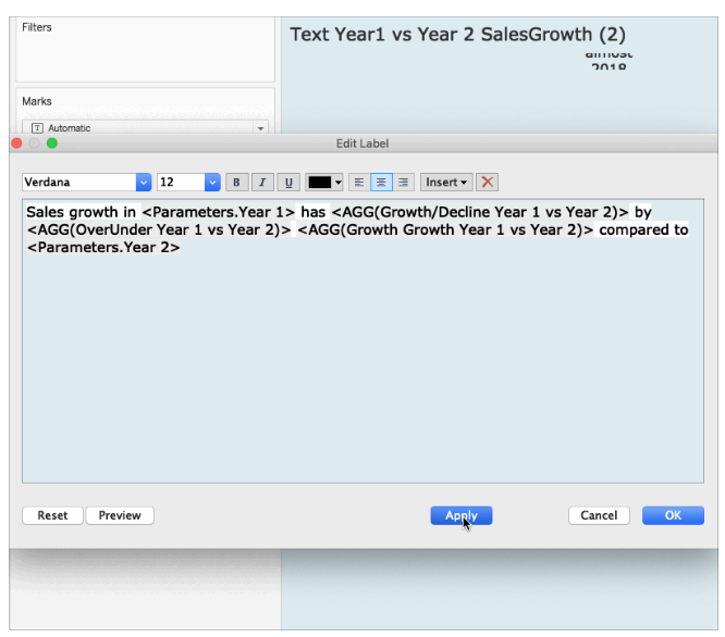
If we take time to clean this up we can create an actual sentence. Remember the sentence you discussed with your end-users or stakeholders? Here we’ll use fixed text with text from the calculated fields, this way we’ll create a dynamic text based on context.
By using calculated fields to compare information and using those calculations to create a dynamic summary we give quick and clear insights for higher management on a higher level or to users that want to see a quick summary in their email, where dashboard interaction is not available. It provides end users with a good idea if they need to dive deeper into the data or if it is not so pressing.
If you want to dive deeper into the inner workings have a look here!
Next time we’ll look into conditional formatting, showing different colours on text whilst colouring the column and having right or left aligned text!
I hope this blog I shared can be useful for you! If you have any more questions don’t hesitate to contact us.
In need of further explanations and help? Join our workshops and trainings or hire a consultant!
Header image from: unsplash.com. Screenshots from author.