One of the best ways to communicate your results/data is through pictures. In the world of football, one method you could use to do this, is to plot your event data on a football field. Bluntly said, this is no more than plotting your scatter plot on a custom image. In this blog I will walk you through the steps on how to create a viz like this:
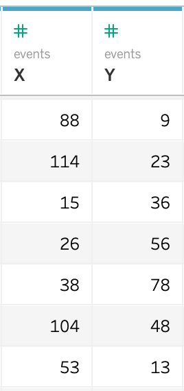
The event data in your data source will contain the location of each individual event, in the form of an X and Y coordinate. Events could be passes, tackles, shots on goal, etc. In my dataset I’ve renamed them to X and Y so it’s clear where to use these fields for.
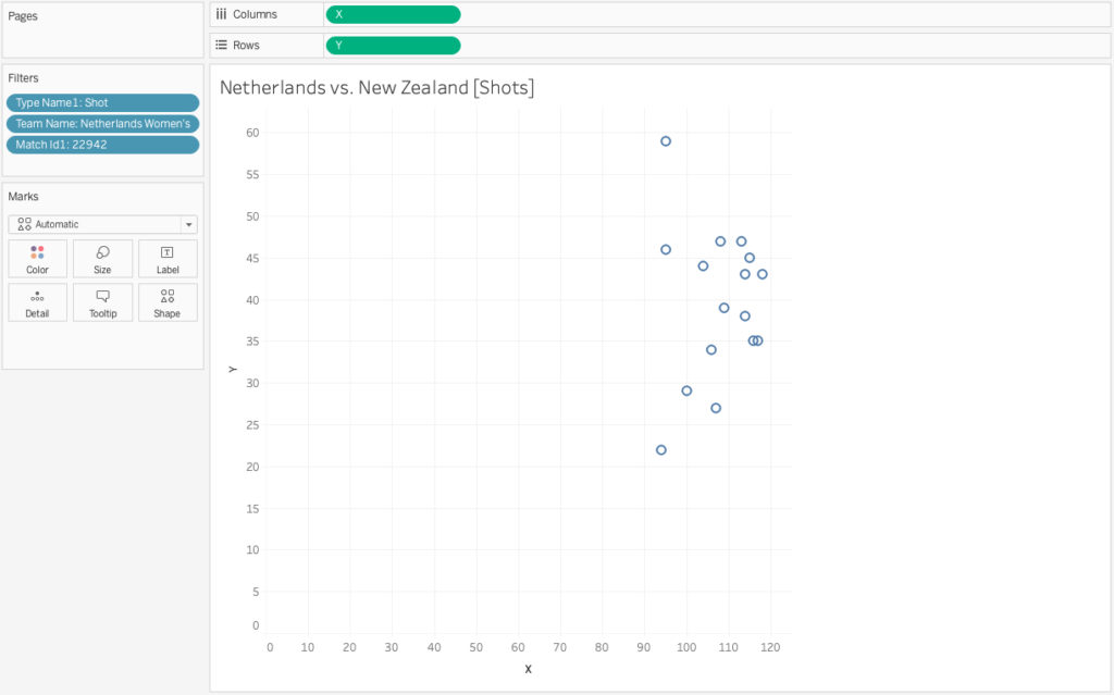
Just like any two measures you can plot these two fields on a scatter plot. As you might know, Tableau by default aggregates measures when you drag them onto the view, so in your menu you have to go to Analysis and uncheck Aggregate Measures. My scatterplot will now show me all 600K marks from my dataset. This is a bit much, so let’s use some filters to decrease this information overload. I want to see only the shots (filter by Type Name), by the Netherlands (filter by Team Name1) in their first match of the World Cup (filter by Match ID1). My scatterplot now looks like this:
That looks better. Now we want to add the football pitch to the view. In the menu bar go to Map > Background Images > [the name of your data source]. When you click on your data source a new window opens. Here you can select the image you want to add. I’ve already downloaded an image, so I can click on Add Image… and a new window opens where I can browse my computer and adjust the properties of the image.
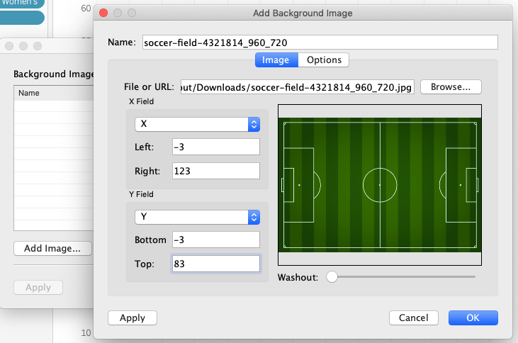
For both my X and my Y field I need to fill in the values of where on the axis I want my image to start, and where to end. I know that the X coordinates in my dataset have values from 0 to 120, and my Y coordinates have values from 0 to 80. As you can see on the preview of the image, there is a little bit of margin on the outside of the field. I want the 0 lines of my scatter plot to be in the same position as the outer lines of my field (since all my event data should be in between my field lines, s 0-80 and 0-120). After a little bit of puzzling I found out that the margin is 3, so therefore the values in my property window are -3 to 123 and -3 to 83.
I can now click OK and the field is plotted underneath my scatter plot:
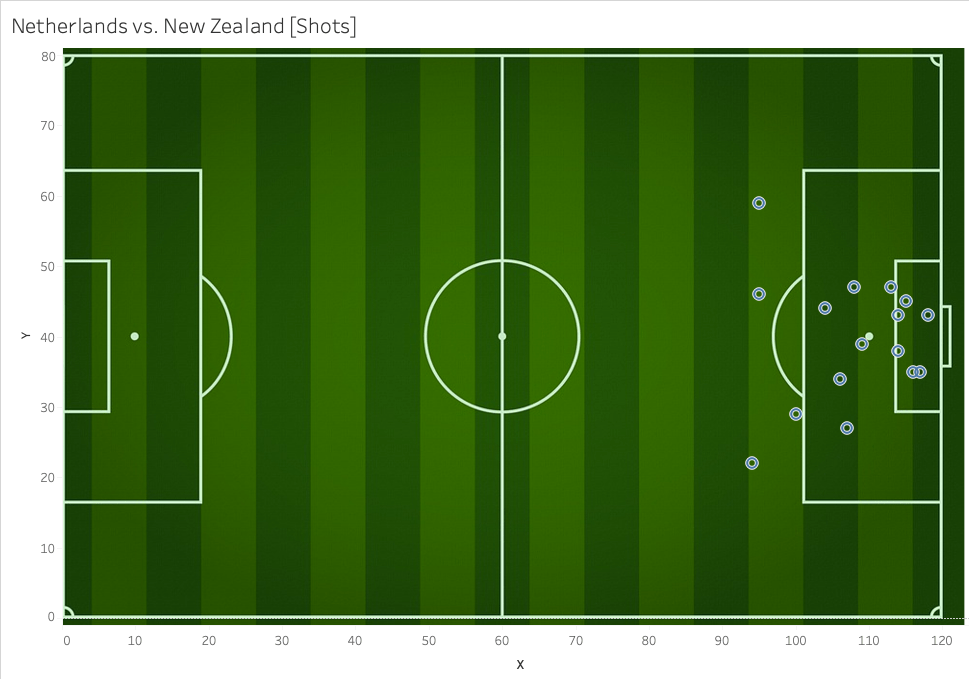
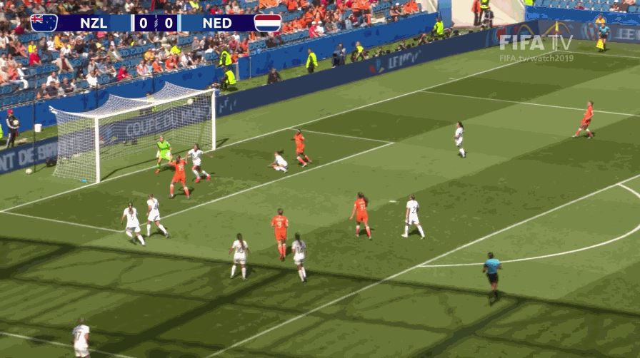
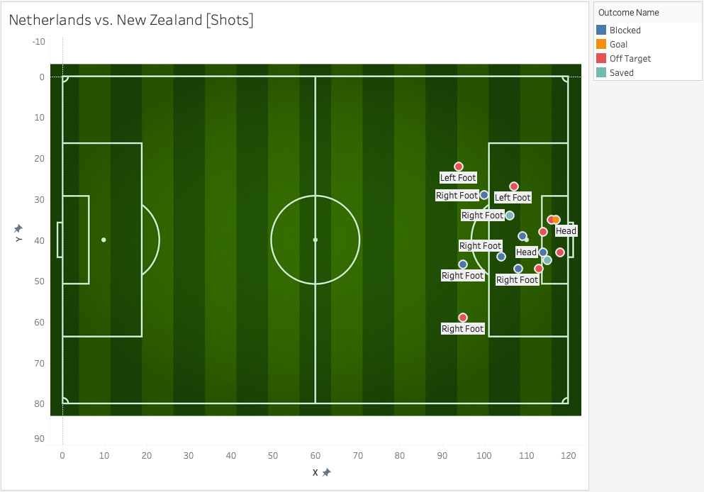
You see the 0 lines of my axes now fall exactly on the outside lines of my field and the shots are all in and around the penalty box, which makes sense.
All I need to do now is to adjust the axes so that they start from -3 (and the whole image becomes visible) and add some more fields to my Marks Card. I’m interested to see which shot became a goal, so I drag the Outcome Name to Color. I change the Shape so that the circles are filled. I also would like to know the body part a shot was taken with, so I drag this to Text. My view now looks like this:
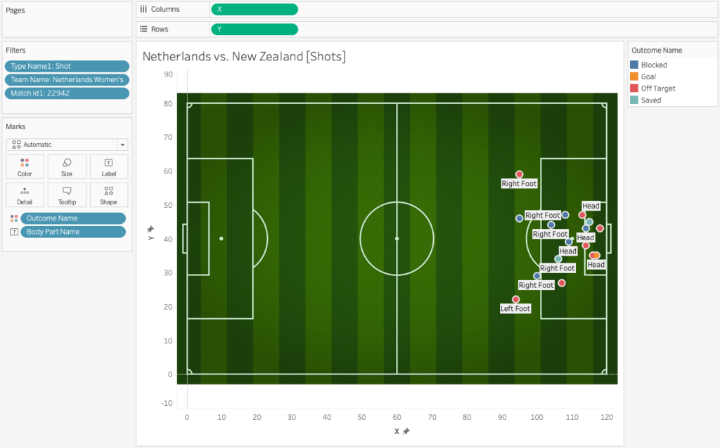
We can see 16 shots in total, of which 12 inside the penalty box, and only 1 goal. I saw this game, so I know the goal (a winning header in extra time, 90+2, is one I can remember) was on the left side of the goal, while in my view it’s now still on the right. I only need to reverse my Y axis (check the reversed box in the Edit Axis menu) and we’re all done.